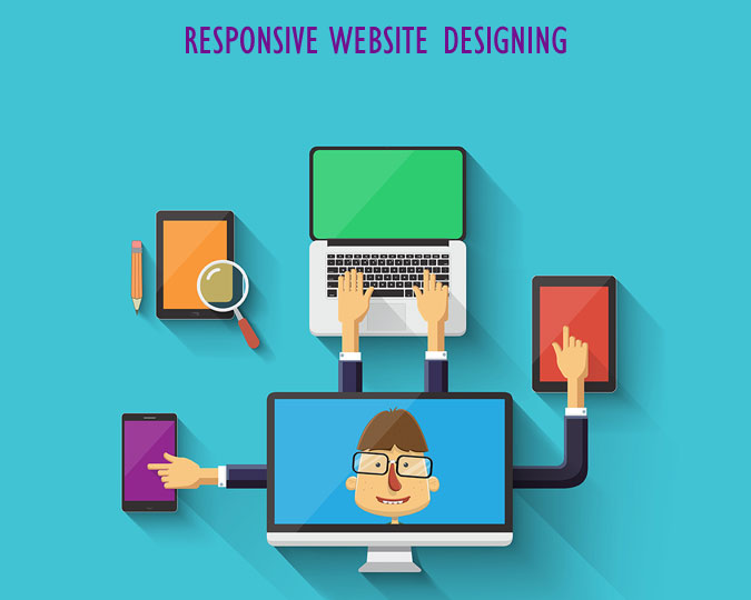
Responsive web design term is related to the concept of developing a website design in a manner that helps the lay out to get changed according to the user�s computer screen resolution. The idea of responsive web design is to make websites that fit multiple screen sizes including Mobile, Tab, iPad, iPhone, Desktop or Laptop.
Customers are not always in front of laptops or desktops. If your customer can't use your site at their convenience, you are unable to deliver customer's expectations. Building a mobile optimized website with essential features and easy navigations, would make your customer stick to your business.
We adopt upcoming trends and implement with latest technologies such as CSS3, HTML5 and framework such as Bootstraps, jQuery and many more. With the help of using up-to-date tools, we deliver enriched solutions. We also take utmost care that the solutions we deliver are browser compatible and fit in each screen size.
Over the years, we have served the companies in different parts of the world including Delhi (NCR), Mumbai, Jaipur, Chandigarh, India, Sydney, Melbourne, Australia, Toronto, Canada, New York, Los Angeles, San Francisco, USA, Dubai, Abu Dhabi, UAE, Doha, Qatar, London, UK etc. Our experienced professional web designers are always ready to provide you unique and cost effective web designing services as per your requirement. Call us right away!